You were thrown out of that posh private party in the suburbs earlier on. The beer was gone, so you nicked some fine spirits from the cabinet of the hostess’ parents and shared generously. You insulted most of the male guests, and flirted with most of the female guests (or was it the other way round?). They discovered the messages you left on the bathroom mirror and disapproved, even if it was the best poetry you had ever written. At least they could not rub it off that easily. But now the girls did not flirt back any longer (or was it the boys?). You could not afford them anyway. The music was terrible, but you could do nothing about it, as you lost your tape at the station where you got your booze for the way to the party. You walked there, activating every motion sensor in every villa along the street with silly dance moves, and deactivating every second lamp post with a kung fu kick. For contrast. Before walking there, you took the bus.
Now you ride the bus again, into the city. You glance cautiously at the mulleted proles with similar intentions. They are as drunk as you are, and they stare right back. They hate your hair, jacket, badges, and shoes. They hate the rest as well. They are always more than one, never on their own. You hate buses. One day you will be able to afford a cab. Actually you could already afford it, but you prefer to spend your money on getting drunk and the outfit they hate. But until the night you can afford all of it at the same time you already think about what will happen if you meet the same bunch tomorrow morning, waiting for the first bus. You will run again. Weekends mean running. Maybe you can run faster. You better try. But you will be not in time anyway, and there will be further trouble once you arrive, either torn and beaten up or not, but wasted either way.
There had been a fight already as you arrive. You see the blood and broken glass. You see the blood on the broken glass. You see a badge on the pavement, and tonight you are wearing the same one. You encounter witnesses. You laugh them off for exaggerating, even if you know they do not. You walk down the stairs to the club. It is never a club with a view. You always descend. You pass the soccer table (it’s those pros with the gloves again, waiting for victims) and head for the bar. You do not know as many people as you expected, and you wonder if this is good or bad. The DJ introduces the dark round. THE BLACK BOX. The black light. You think it is a bit much that not only the stains on your clothes glow in the dark but your drink does, too. It tastes like cheap liquorice. THE COUNT. You think it would be funny if the count would really be here, targeting future playmates among the Blixas and Siouxsies. You think it would also be funny if the dancers would have to throw their agony shapes accompanied by the meagre disco lights, while the imminent disco round would be hidden by heavy fog. But the punk round always come first. DOCTOR ANNABEL LIES. DOCTOR ANNABEL LIES. DOCTOR ANNABEL LIES. It’s either Buzzcocks next, or something for the scooter boys. But they are not that present tonight, so it means a shortcut to synths, and the floor is split between the heavy fog and the meagre disco lights division. IT’S THE ONLY WAY TO LIVE. In bars. In bars. Ha. You compare your own unimpressed look to others. You realize the button on your jacket’s pocket came off again and your cigarettes are gone. Your keys as well. You decide to postpone the consequences as long as possible. For the keys at least. You will have to wait until the lights come back up to fish for some cigarette money and you get one from the soccer table pros. You wonder if they have a theme song. HAND IN GLOVE. Oh, the irony. THE SUN SHINES OUT OF OUR BEHINDS. Sun. Ha. You are determined your next drink will be something fruity that does not glow in the dark, and you wonder if that is even possible. You get a warm beer instead. And some mean shot. You want results. You take a leak, you hear someone snorting bad speed. As if anything in here really requires chemical pace. You read the same tired jokes on the wall. You check your hair in the broken mirror, even if it is does not need checking. You read the same tired jokes written on there, too. Back in, another round. A lighter one. Quiffs and Marc O’Polo sweaters, predictably. You recognize that girl from the party hours before (or was it a boy?) FROM THE MOUNTAIN TOPS DOWN TO THE SUNNY STREET. Ha. A DIFFERENT DRUM IS PLAYING A DIFFERENT KIND OF BEAT. Ha Ha. You think the DJ could be smarter than anybody else in here. Except you, of course. Later you wake up next to a girl on that dirty sofa (or was it a boy?). You are not sure if anything happened. It does look a bit as if something happened. No, actually you just do not know. Not many people left, slow songs already. TAKE YOUR HANDS OFF ME. You watch the very recent couples, who ignore the instructions. You are too wasted to join in with whomever. WELL IT JUST WASN’T ME. Maybe half an hour left before exit into daylight, and then you will have to run. Oh well.
BUT…
This is not a true story.
Everything will be different.
We invite you to hear the BEST FUCKING MUSIC EVER.
You were thrown out of that posh private party in the suburbs earlier on. The beer was gone, so you nicked some fine spirits from the cabinet of the hostess’s parents and shared, generously. You insulted most of the male guests and flirted with most of the female guests (or was it the other way round?). They discovered the messages you left on the bathroom mirror and disapproved, even though it was the best poetry you had ever written. At least they could not rub it off so easily… But now the girls (or was it the boys?) no longer flirted back. You couldn’t afford them anyway. The music there was terrible, but you could do nothing about it as you dropped your tape at the petrol station where you’d bought your booze on the way to the party. You had walked there, activating every motion sensor in every villa along the street with your silly dance moves, and deactivating every second lamp post with a kung fu kick. For contrast. Before walking there, you took the bus.
Now you ride the bus again, into the city. You glance cautiously at the mulletted proles, all with similar intentions to yours. They are as drunk as you are. They stare right back. They hate your hair, your jacket, your badges, your shoes. They hate the rest of you too. There’s always more than one of them. They are never on their own. You hate buses. One day you will be able to afford a cab. Actually you could already afford one, but you prefer to spend your money on getting drunk and that outfit they hate. But until that night you can afford it all, around now is when you begin to think of what will happen should you meet the same bunch tomorrow morning, waiting for the first bus. You will have to run again. Weekends mean running. Maybe you can run faster. You’d better try. But you won’t be in time and anyway there will be further trouble once you have arrived, either torn and beaten up, or not – but wasted either way…
You arrive. There’s been a fight already. You see the blood and broken glass. You see the blood on the broken glass. You see a badge on the ground. Tonight you are wearing an identical one. You encounter witnesses. You laugh them off for exaggerating, even though you know they do not. You walk down the stairs to the club. It was never a club with a view – you always descend. You pass the soccer table (those pros with their gloves on again, waiting for victims) and head for the bar. You don’t know as many people as you had expected. You wonder if this is a good or bad thing.
The DJ starts his dark set. THE BLACK BOX. The black light. You think it a bit much that not only the stains on your clothes glow in the dark but your drink does, too. It tastes like cheap liquorice. THE COUNT. You think it would be funny if The Count would really be here, targeting future playmates among the Blixas and Siouxsies. You think it would also be funny if the dancers would have to throw their agony-shapes accompanied by the meagre disco lights, while the imminent disco set would be cloaked in heavy fog. But the punk set always come first. DOCTOR ANNABEL LIES. DOCTOR ANNABEL LIES. DOCTOR ANNABEL LIES. It’s either Buzzcocks next, or something for the scooter boys. But they are not so present tonight; a shortcut to synths and the floor split between the Heavy Fog and the Meagre Disco Lights factions. IT’S THE ONLY WAY TO LIVE. In bars. In bars. Ha! You compare your own unimpressed look to that of the others…
You realise the button on your jacket’s pocket has fallen off again and your cigarettes are gone. Your keys as well. You decide to postpone the consequences as long as possible. For the keys at least. You will have to wait until the lights come back up to fish around for some cigarette money – but for now you will blag one off the soccer table pros. You wonder if they have a theme song. HAND IN GLOVE. Oh, the irony. THE SUN SHINES OUT OF OUR BEHINDS. Sun. Ha! You are determined your next drink will be something fruity that does not glow in the dark, and you wonder if that is even possible. You get a warm beer instead. And some mean shot. You want results. You take a leak. You hear someone snorting bad speed. As if anything happening here really requires chemical pace. You read the same tired jokes on the wall. You check your hair in the broken mirror, even though it doesn’t need checking. You read the same tired jokes written on there, too. Back in, another round. A lighter one. Quiffs and Marc O’Polo sweaters, predictably. You recognise that girl from the party hours before (or was it a boy?) FROM THE MOUNTAIN TOPS DOWN TO THE SUNNY STREET. Ha! A DIFFERENT DRUM IS PLAYING A DIFFERENT KIND OF BEAT. Ha ha!! You think the DJ could be smarter than anybody else in here. Except you, of course…
Later you wake up next to a girl (or was it a boy?) on that dirty sofa. You are not sure if anything happened. It does look a bit as if something happened. No, actually, you just do not know… Not so many people left now. Slow songs already. TAKE YOUR HANDS OFF ME. You watch the very recent couples, who ignore the instructions. You are too wasted to join in, with whomever, anyway. WELL IT JUST WASN’T ME. Maybe half an hour left before your exit into daylight — and then you will have to run. Oh well.
BUT…
This is not a true story.
Everything will be different.
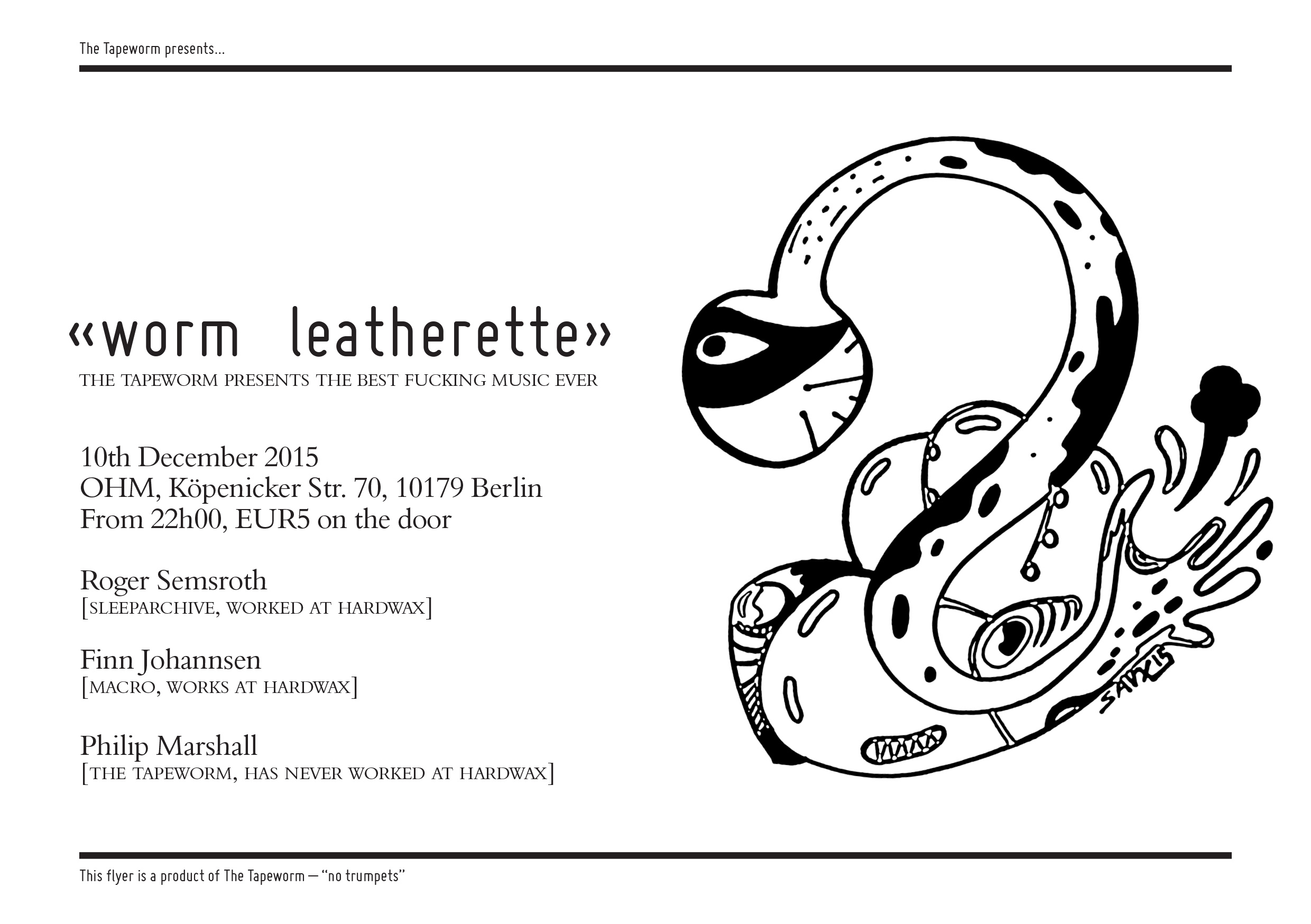
We invite you to hear the BEST FUCKING MUSIC EVER.
NO TRUMPETS (maybe).
Do swing by and bring some love. And other people.
We love you (YOU PAY OUR RENT).
Wormest Regards,
Finn, Roger unt Wyrm.
(The Tapeworm dedicates this evening to the memory of Massimo Pavarini, who bloody well should’ve been dancing with us tonight…)
Should anybody starting up a label in these crisis-shaken times even consider commissioning a proper graphic designer for label artwork, or is it better to spend the money elsewhere first? Have priorities changed?
Running a boutique label is a very good way to spend a lot of money with no real certainties of seeing that money again… A label’s or artists’ art direction can be an amazing strength, if well done. But, the initial attitude and concept of the release, the sequencing, its originality, the quality of the mastering – all these factors are important. I would suggest that unless you view every aspect of the release, including the cover art, as essential, then don’t bother. It’s all part of a beautiful whole.
Could you observe some sort of increasing DIY approach from the labels’ side in reaction to shrinking production budgets?
More, an increasing desire from labels to ask designers to work on tiny budgets. DIY: whereas at one point one would have a budget for a full campaign, these days the money goes less far – sometimes the finest details are skipped…
As someone who designed for bigger labels and smaller ones, are there differences in the assignments and necessities besides financial aspects?
In my experience, the success of any project, regardless of size of the label, depends entirely on a client/artist/someone in the process, having an eye for such details. Simple as that. I have worked for both large and small labels where a key individual has had personal interests in the whole and has allowed more time, money or “play” to occur. I’ve also known indie labels, full of cred, simply not be bothered by their design output. I’ve known major artists and marketing teams get very excited about artless details – “make the logo bigger” etc… But, so long as someone cares, or someone trusts enough, something good is usually allowed to happen…
Do you think that the flooding with releases even requires a bigger effort in the design stakes, to already stand out visibly?
The flood is a digital one, mostly, and there artwork is somewhat lost – and few artists have begun to think, or had budgets to realise, what an album could be in these iPadded times… An effort, a point of difference, always is a good thing. However, there are so many people broadcasting on so many blogged-out channels, broadcasting to an ever-distracted audience, that one wonders if much what one sees sticks in the memory… Famous for 15 people…
How do you best make a point if you opt for artwork as a label owner?
I prefer direct – one message, simple, clear, yet with attention to detail, something other…
Are there rules for what a good artwork for a record release should display?
That’s a very difficult question to answer, as each release/artist/label has different requirements. Each project should be approached on its own terms.
Is there some kind of solidarity between designers and label owners to keep both fields going?
There are definitely teams – links between musicians, labels, archivists, curators, designers – who work well together, who have a shared agenda to keep on keeping on.
What do you think of alternative ways for artworks, like stamps, stickers, inserts etc. Do they limit the possibilities, or the opposite?
Again, each project should have its own voice, its own language – sometimes such things could work.
Would you say that the days of stamped white label releases to generate some mystery are soon over?
A mystery lasts a lot less long these days; “I have a mystery to share with you all” screamed from many social networks… One can still try to work in hiding, and this to me seems increasingly appealing, when there’s simply so much noise out there, so much broadcasting of average product. But then, to generate mystery in itself, the release must be perfect.
Is corporate identity still important for a label, or should every release test new ground?
I think that depends on whether the label wants to be an artist itself, to have a curatorial role. Certainly a house-style can amplify an imprint’s voice.
What will the near future be for graphic designers in the music business? Is a designed physical release something that will still matter?
I hope that as long as there are people making music and releasing music who have a passion for the sheer beauty of what an object can be, and as long as there are designers who simply want to do something out of love, not money, there will be. …but, if I knew the answer to that… I’d be learning Android app programming.
In discussion with Philip Marshall about the album “Introspective” by the Pet Shop Boys (1988).
There is plenty to choose from in the history of the Pet Shop Boys, why did you pick this album? It’s all about time, and my personal trajectory. In late 88 I was 16, going on 17… And life was unfurling before me. No longer trapped in suburbia, I was spending increasing times in London Town, growing up, and learning all about myself – clubbing and all that entails included. I dug deep into London’s rich vein of “equity culture”, and quickly discovered my late teenage was perfectly in sync with the most exciting of explosions in music culture since post-punk. At this time, lines were blurred. I made a commitment to myself, and sold off hundreds of indie vinyl down the Notting Hill record & tape exchange in order to fund my new-found love of nightlife and the music coupled to it. No mop-headed moaning guitar drivel would ever sully my collection again (or, so I thought back then…). An end to teenage angst, sold by the crate-load. Out with the gloom. In with 808 State, Electribe 101 and never ending weekends… But, the electronic pop I had loved when young stayed with me…
I think it is safe to say that they wanted to do something different from their first two albums. How do you place this in the output of the Pet Shop Boys?
It’s all about timing – “Introspective” was released that November, when my introspection first ended. A thread – from a pop past, to a future life. For them, it was a definite embrace of the then fresh house culture that Europe had plunged into – a relatively brave move for an established pop act and before others, such as ABC, jumped that train… As far as placing in their personal timeline, well one of the things I love about this album is its single-minded stance. Although the songwriting and lyricism is as strong as what went before and what was to come, its formatting, arrangement and structure was wilfully, almost arrogantly, other. Here was a group having number one hits in Europe and the USA, coming off the back of two consecutive number ones, and returning with a release that 1.) was six tracks long, 2.) comprised of extended mixes, 3.) didn’t have their image on the cover, 4.) was oblique, lyrically, in parts… The confidence and, presumably, freedom from EMI’s meddling that their earlier success lent them, afforded them the space to make an other statement. A few weeks ago, I was tearing through the English countryside with Jon Wozencroft , on our way to a Suffolk performance. His car had a cassette player, and we were rifling through his old tape collection. “Introspective” was played. We agreed; it is the “Sgt. Pepper” of house – the sound of a band at the peak of its popularity stretching and flexing its remit without fear of a crash. Read the rest of this entry »


Recent Comments